Vertigo Style Movie Poster
Completion time: 10 minutes
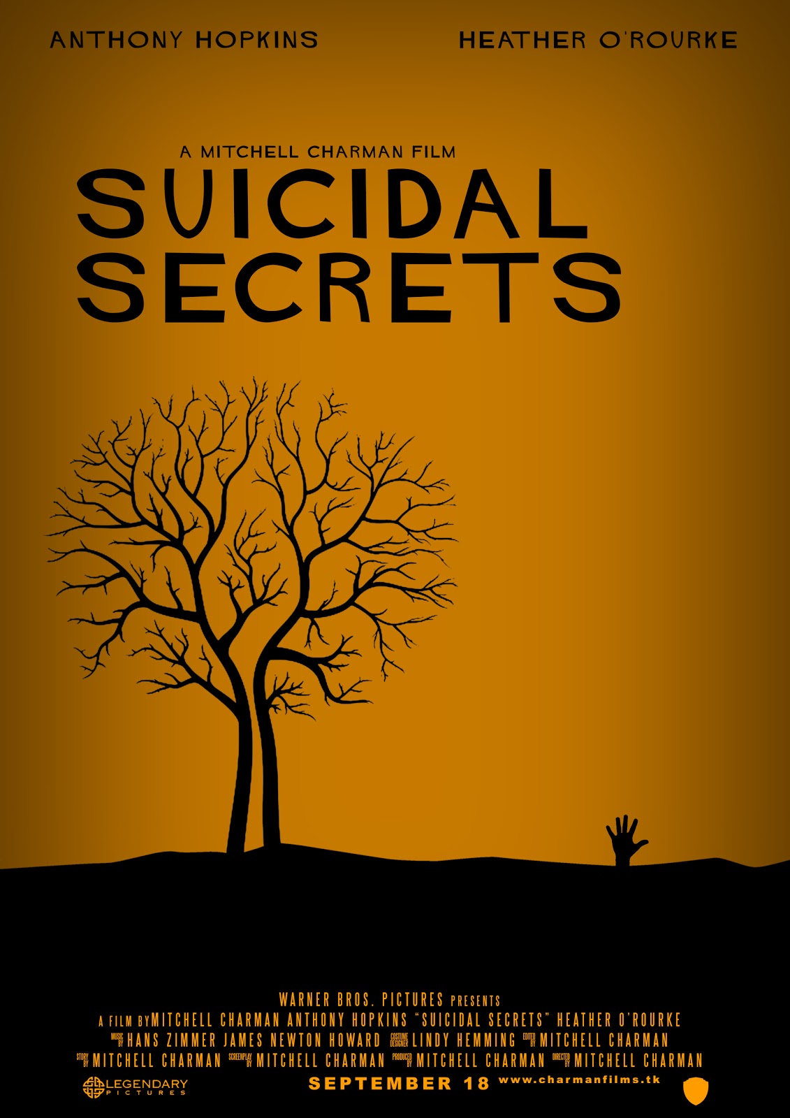
I made this for a Year 10 Media project. This was 1 of 5 movie posters, and this I whipped up in literally 5-10 minutes for bonus marks (we were only meant to do one).
1. The Poster: First thing's first; we have to set up our Photoshop document. Click 'File' and 'New'. Since I'm Australian I go under the 'International paper' tab and click A3 and because this is a file to be printed I made it 300 pixels/inch. I made the background colour c87a00 which is the kind of dark orangey colour you see in the finished poster above. You can pretty much use any colour, it doesn't matter. The text and objects are black so they go well with any colour.

2. Vignette:
(NOTE: If you know a better way of doing this, do it and skip this step, we're just making a simple vignette) I made a new layer (common mistake, it's not editable if it's on the same layer as the background) then clicked the Rectangular Marquee Tool. Now the next step can be done two ways. One is before you make the selection and the other after. You can go to the top of the photoshop screen just below the 'Edit' tab and change the feather for the marquee tool to 400px. The second way is, after making the selection, right-click (control+click or two finger click on the magic trackpad like me ;) for Mac) and then click 'feather' in the drop down and make the selection then. I made a selection about 2.5cm (an inch) from the edges on the document using the marquee tool. If you haven't already, right-click and feather it to 400px. You should end up with something like this:

Next I right-click, 'select inverse' and right-click, fill, black. You can mess around with the opacity and the size using the free transform (Ctrl+T or Cmd+T for Mac). My version has it scaled up a little and the opacity has been brought down to 63%.

3. The Objects:
In my poster, I have a tree and a hand on a black "earth". Let's start with the tree. It's a picture from Google Images, the link is here. You can use any method you want to cut out the centre tree, but unless you want to spend hours on this, you'd be wise to use a combination of the Magic Wand Tool and the Rectangular Marquee Tool. Using the Magic Wand, click on the white around the tree then switch to the Marquee Tool and, while holding shift, drag the box over the logo in the corner and the smaller trees. Click delete then re-select the Magic Wand and click on the blank area. Right-click, select inverse then right-click, feather, 1px and lastly right-click, fill, black. This will make a black tree silhouette.

Next is the ground. I used the pen tool and randomly clicked in a general direction across from left to right. I then finished the path outside the canvas then I right-clicked, make selection, 1px feather. Then, for something different; right-click, fill, black. I positioned the tree over the black slightly to the left to make room for the hand but you could leave it in the centre if you don't want to make the hand.

For the hand I used this picture and then applied the same technique used for the tree. Magic Wand-ed the white around it, delete. Then select empty area, right-click, select inverse; right-click, feather, 1px; right-click, fill, black. I positioned it beside the tree in the ground.
NOTE: You don't have to use a hand. Or a tree. This principle of silhouetting shapes can be applied to any picture. It's easier for pictures on a plain background but if you find something you like with a detailed background good luck.

4. The Titles:
-I used a specific Vertigo font which can be downloaded free here. I used a Copyrighted name (Sorry guys) in this font and just scaled to my desired size.
-I watched Silence of the Lambs and Poltergeist the other day, so Anthony Hopkins and Heather O'Rourke were the first names that came to mind. Choose any names you want to put at the top. However many, whatever size.
-Lastly the credits. There's probably a font out there that does it for you but I had a preset I made in Illustrator. With a little bit or searching you could find fonts that imitate a movie poster credits. Another way is to look at a movie poster and copy how they have written them. I made it the same colour of the background.
And that's it. Play around with the colours, pictures and text. There isn't any importance to how any of it is set up, and you could come up with some pretty interesting posters if you spend a little time tweaking things. It's often the little changes that make the biggest differences. Post any questions or comments below and look out for the latest (more advanced) tutorials.